Thursday, September 25, 2008

Activity #2


I chose Belief by John Mayer for this activity because it it one of my favorite songs and I believe that a lot of his statements in the song are true. It was hard for me to decide at first which of his songs to chose because many of them have a great meaning to me, but when I remembered this one I knew it was the one. As a young person, I think that many of my peers may relate to this song as well.

I think that in this song, John Mayer is trying to explain that the reason for many of the struggles and conflicts between people are sometimes simply because the sides have different beliefs, and it is not always possible to change someone's beliefs. For example, he says that no one changes their mind just from "paint on a sign" or from someone just yelling "loud one time". Everyone has their own beliefs and not many people are willing to give them up, hence the line "Everyone believes in how they think it ought to be... and they're not going easily". Another line in the song says "We're never gonna stop the war, we're never gonna beat this if belief is what we're fighting for". This could be applied to the current war our country is fighting because I believe that it is true that we cannot win the war if we begin to fight for "belief" and to try to change the beliefs of others.

This song means something to me because the lyrics are powerful and it tells how powerful beliefs can be and what they can do to people, like put "a hundred thousand children in the sand" or a "folded flag inside his mother's hand”. I can also relate to it because I know that when I see someone being obnoxious about trying to change people's beliefs, like about the upcoming election for example, it definitely does not change my mind. I think that many others feel the same way as well, and also appreciate John Mayer's lyrics.

I changed the font of quite a few of these lyrics to try to express what they mean to me and possibly to others. I changed the word "belief" throughout the song to a light blue curvy italic font to express that beliefs are intimate values that people hold. The fact that I put the words “one time” in very small letters shows how insignificant it is for someone to yell something loud just one time. The phrase “they’re not going easily” is in a bold font with capital letters to show that people are not going to change their beliefs very easily. For the phrase “like punching underwater” I used a small and curvy blue font which is hard to read to signify that it is difficult to punch someone underwater. I believe the chorus of the song is the most important part. For the one of the phrases, “we’re never gonna win the world” I bolded the word “never” and used red white and blue font for “win the world” to express that this part of the song could apply to our country. The last section of the song is fairly sad, because it talks about how beliefs and standing up for them can cause horrible things. For example, one line reads “what puts a folded flag inside his mother’s hand? Belief can…” I put the word “flag” in red and blue writing to show it may possibly represent a fallen soldier.

I think that the changes I made to the font of the lyrics help to express the meaning of them and show the power of belief. Making these changes also made me think more deeply about the words and the song in general and what its purpose is.

Monday, September 22, 2008

Project #1

For my project, I plan to do a 6 slide power point presentation. The topic I chose is simply how every day plastic products are used too much and how they harm the environment, but also how I have noticed an increase in people trying to cut down on their usage. I chose this topic because where I work, when we receive boxes from shipping with items to sell, I always notice how unbreakable items are wrapped in ridiculous amounts of plastic.

After I became more aware of how most plastic bags are not biodegradable, at work I began asking every customer if they wanted or needed a bag instead of just giving it to them. I was surprised at the amount of people who say no, when normally they would have taken one if I had just given it to them. Pictures that I plan on using will include stacks of plastic bags, and small items wrapped in large amounts of plastic.

I plan on explaining in the power point how I noticed how people use too much plastic, but also how I have been noticing more people carrying large tote bags when they shop so they do not have to use plastic bags, so I may include a picture of someone using a tote bag. I chose this topic because I never really thought there was an effort-less way for me to help this problem, but now I see that I can in very simple and easy ways.

Sunday, September 14, 2008

Screen Capture


My screen capture shows Activity 1 in progress, my Facebook window up, and AIM on the side. I chose this screen because at first I had a little difficulty with Activity 1 and what I needed to do. I have never had a blog before so I was slightly confused at first. My Facebook window was also up because it always serves as a great distraction from my homework. I am also logged on to AIM on this screen because this also serves as a distraction for me. As you can tell, I rarely finish a task in one try at home because I allow myself to multitask on other things that are not as important.


Composing changes shape and is very different in digital spaces. Working on tasks on a computer is usually very different from hand writing things. For example, using a word processor is different from writing it by hand because spell check instantly highlights any possible errors and counts words. Emailing also makes a big difference if I were to have questions regarding an assignment. It makes it possible to send a message immediately. In addition to that, rather than drawing out pictures, we can simply browse the internet and paste them on our piece of work.


We can better understand the digital composing process by using it more and more and by viewing others’ work. With the internet and computers being such a huge part of the world and growing every day, it is very important that we do our best to become adapted, aware of, and appreciate and recognize the digital composing process. Making sure to keep up to date on new additions and advances will make a big difference in our knowledge.

Activity # 1


4. The image I chose tags for was the picture of the peep. Tags that I would choose for this image would be peeps, easter, candy, rabbit, bunny, french, purple rabbit, holiday, and animal.


6. The Alta Vista logo is professional and futuristic looking. It looks like it would be reliable, though you cannot judge something like that by it's look. The Yahoo logo is energetic looking because of the exclamation point and the shape of the red scattered letters. The Google logo is colorful and attractive. I like t
he Yahoo logo the best because of its energy and active look. The color red stands out and is attractive. I like the Alta Vista logo the least because it does not catch your eye like the others do. It is simple and boring.


13. I would advise people conducting research on the web to be careful what they believe and to do careful research before deciding if something is legitimate. I would tell them to look for sarcasm and jokes that may mean that a certain site is not a serious one. Just because something looks professional does not always mean that it is. It is also important to look for a bibliography or a list of their sources to see where they got their information and if it is credible. Contact information if available may also be helpful in deciding if the site is valid. Using advice on the help page of a search engine may provide additional help. When evaluating visual content, you should look for background information on photographs and copywright information. Look for the name of the photographer as well. Also trust your own eyes when looking at it to see if it looks like it has been changed or edited somehow.


Mini-Glossary

Representation (noun) is "the act o
f representing or the state of being represented" (http://www.answers.com/topics/representation). It is usually a symbol or design that stands for something else like another idea, thing, person, etc. Example: a heart symbol is a representation of love.


To design (verb) is to create and conceive something in your mind, and/or then express it in a physical form. It is planning and preparing something artistically. An example would be deciding and imagining an image to draw, and/or actually drawing it out.


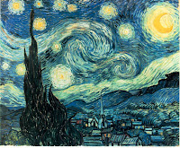
A design (noun) is an artistic and visual representation of an idea. It is something you can see that is created by someone like a painting or drawing. An example would be the painting Starry Night.


Seeing is the act of viewing a fact and observing something visually. It is a visual perception. You see something and you may remember the image in your head later. An example would be simply seeing and watching a person walk by.


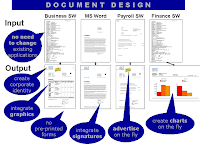
A document design is the way someone creates texts or compositions, combining the use of words and pictures to effectively communicate a message. Someone could use Microsoft Word, Paint, Power Point, Excel, etc. An example would be someone creating a power point presentation including text and photographs to provide information or persuade someone about an idea.

Tuesday, September 9, 2008

Composition Choice : Lucky

The composition I chose to write about is the cover of a memoir called "Lucky" by Alice Sebold. The cover for the current version I own was created in 2002. ALice reveals the story of how she was brutally beaten and raped (not pleasant, I know) near Syracuse University when she was a freshman in college. She titled the book Lucky because a police officer told her she was lucky because her rapist usually killed his victims, though she did not feel very lucky. The cover of the book is ironic because it has a picture of a rabbit's foot on it, which is a symbol of luck.